Star Market – UX Case Study
Grocery Shopping, Reimagined
Responsive Website Redesign + Native Mobile App Concept
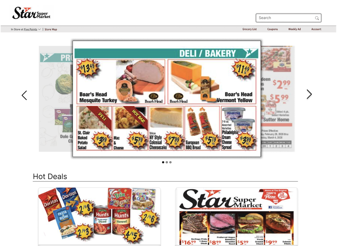
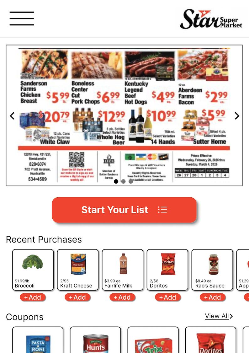
Overview
- Client/Subject: Star Market – a real, independently-operated grocery store in Huntsville, AL.
- My Role: UX Researcher & Designer (end-to-end – research, personas, wireframes, hi-fi design)
- Tools: Figma
- Context: Completed as the capstone project for the Google UX Design Certificate
- Scope: Star Market had an existing website but no mobile app at the time of this project. This project redesigned the website experience and designed a new native app concept from the ground up.
The Problem
Star Market Customers had no way to look up a store layout, product location, or a digital grocery list without either browsing a cluttered existing website or asking a store employee directly. For some shoppers, this created real friction – from busy people trying to shop quickly, to customers who specifically wanted to avoid employee interaction altogether.
Goal Statement
Our Grocery store app will let users find items in the store on a digital map, which will affect busy parents or people with anxiety disorders, by allowing users to grocery shop without interacting with store employees. We will measure effectiveness by number of app users during operating hours.
Research
Competitive Analysis
Compared Star Market’s existing website directly against Kroger’s website and app – a much larger competitor with a mature digital experience – to identify gaps in navigation, digital tools (store maps, list-building, coupons), and overall usability.
Research Study Plan
Wrote a formal research study plan to test whether a grocery app could genuinely help customers locate items and shop faster:
- Research Questions:
- How long does it take someone to grocery shop?
- How long does it take someone to locate a specific grocery item?
- What can we learn from observing people grocery shop?
- How can we make grocery shopping more efficient?
- KPI’s: Time on task, use of navigation vs. search, System Usability Scale (SUS)
- Methodology: Usability study + observational study, conducted both in-store at Star Market and remotely
- Participants: 9 total – people who grocery shop twice a month or more; 3 female, 3 male, 3 non-binary; ages 16-70; varied ethnicity.
- Incentive: Grocery store gift card
This study was designed as part of the research phase but was not formally conducted. It stands as a research plan demonstrating how the concept would have been validated with real users. Running this study would be the natural next step before moving any further toward development.
Personas
Two Personas emerged from the research goals, representing different motivations for wanting a faster, lower-friction shopping experience:
Shelly
17 – High Schooler
“Talking to new people gives me severe anxiety.”
Goals
- Quickly grocery shop.
- Avoid talking to a store employee.
Frustrations
- Having to ask store employees for help.
Caroline
36 – Business Professional
“I’m so busy and like to compare specific brands.”
Goals
- Quickly grocery shop.
- Compare brands of the same item.
Frustrations
- No time to ask for help.
- Limited family time.
Defining the Solution
Used If/Then statements to connect each persona’s need directly to a measurable outcome:
If Shelly can use an app to find items in the grocery store, then she can quickly find items without having to ask for help.
If Caroline can use an app to find things in the grocery store, then she can save time by being able to quickly find what she needs.
This kept the feature set anchored to real user outcomes rather than a generic feature list.
Accessibility
Accessibility wasn’t carried through as a specific focus in the visual and interaction design itself. That’s a real gap in this project as it stands, and one worth naming directly rather than glossing over: the research ground work was accessibility-conscious, but the resulting designs weren’t audited or build out with WCAG-specific decisions.
Outcome + Reflection
This project reinforced how much grounding early design decisions in real research changes the outcome – the goal statement, personas, and if/then statements kept the feature set focused on actual user needs rather than a generic list of “things a grocery app should have.”
The natural next step would be twofold – actually conducting the usability study that was planned, and going back through the hi-fi designs with a WCAG/508 audit to make sure the accessibility intent from the research phase shows up in the final product, not just the plan.